top of page

HH Black Line
HEAVY HITTERS
We created a darker, more refined visual world built around an intricately illustrated spade — a symbol of rarity, precision, and mastery.
The system extended across packaging, beverages, limited releases, and collector editions, giving each product its own presence while keeping the family unmistakably Heavy Hitters.
Impact
The Black Line gave Heavy Hitters a distinct premium tier with a recognizable design language built to support future products, collaborations, and limited releases.


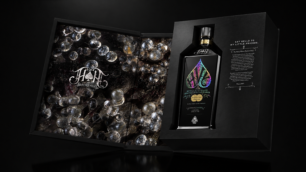


Heavy Hitters Product Family
Challenge
As Heavy Hitters expanded into limited releases and ultra-premium products, it needed a visual language that could express greater rarity, craftsmanship, and distinction without losing the equity of the core brand.
Brand Design & Logo | Packaging Design | Product Family Architecture | Creative Direction | Retail Marketing
bottom of page